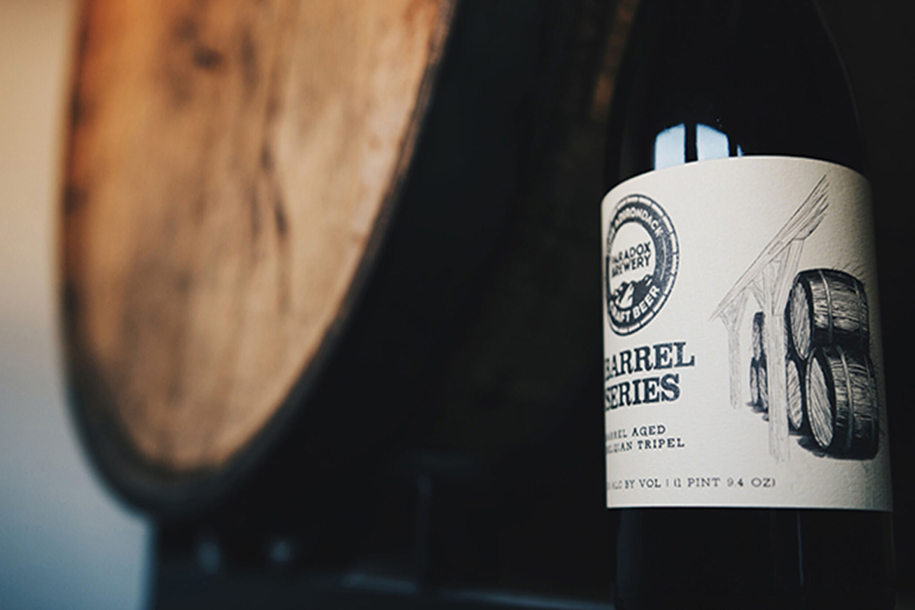
With the rise of craft beer and so many breweries out there, it’s hard to stand out. Not only do you need great beer but you need a solid brand as well. One of the first breweries we had the chance to work for was Paradox Brewery (PB). Having recently one 3 medals at international and national competitions they came to us in 2015 asking for a revamp on their website and help to grow their brand. After meeting with them it was time to get to work!
01.
THE VISION
Paradox Brewery was already fairly well known in their region but wanted to spread their brand across all of New York and eventually into other states as well. Coming to us they were looking for a redesign of their current logo, a new user-friendly website, and can designs for their multiple lines of beer. With a redesigned brand they were hoping to expand their business and gain more customers. They are proud of their Pure Adirondack Beer made from water sourced from 600 feet below the Adirondack Park. Being based in the Adirondacks, they wanted to carry this over as their theme for their brand. After talking to them about how they wanted to go about this process we got to work.
Read More: 6 Steps For Developing A Customer Base
02.
THE LOGO
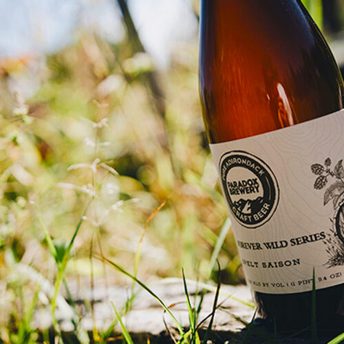
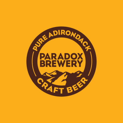
Their old logo was heavy in words and had no images in it. While using their company colors and existing structure, we took out some of the words, used a more appealing font, and added an illustration of mountains to the logo. This created a more intriguing and memorable logo that they were now proud of. This was the first step of our process because we needed a logo that we could carry over to the rest of their branding process.
Read More: 5 Steps To Start A Product Line For Your Business
03.
CAN DESIGN
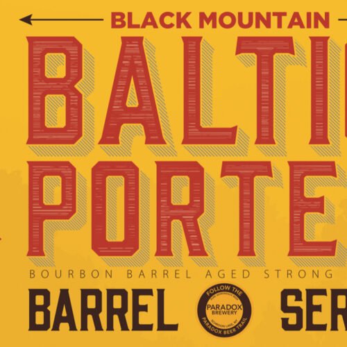
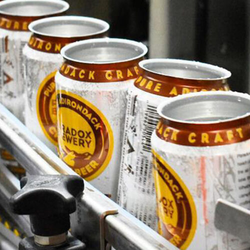
Having four different beer series on top of their core beer lineup, they needed designs for all of these. PB wanted designs were that recognizable across the board while also incorporating their Adirondack theme. By placing their new logo, changed to have the name of the beer on it, on every can we created a common image that people can recognize with Paradox Brewery. In addition to this, we designed unique backgrounds for all the cans. They all embody the Adirondack spirit with illustrations of mountains, wildlife, forests, and more.
04.
WEBSITE DESIGN
The most essential part of their branding process was their website. PB wanted a site as good as their beer. To do this we created an entirely new website from scratch. We designed a website that was appealing to the eye and also user-friendly. Using their company colors and an easy to follow layout, the new website now matches the quality of their beer, extraordinary. Since they were looking to enhance their users’ experience and expand their brand we added several key components to make this happen.
Most importantly, we made it a responsive design. This allows someone to access it and have a consistent experience on any device, phone, computer, or whatever it may be. Having this is essential to any website nowadays because everyone is using different devices to go on the internet. We also added an interactive contact form right onto their website. Instead of just putting a phone number or email for the user to reach out to, this allows them to directly contact PB right on their site with any questions or comments that they have. Additionally, we added an online sales platform to their website. This expands their business by allowing customers to buy their products from anywhere online. All of these things combined with a sleek design created a website that will carry their brand into the future
Read More: 3 Basics Of Selling Online

