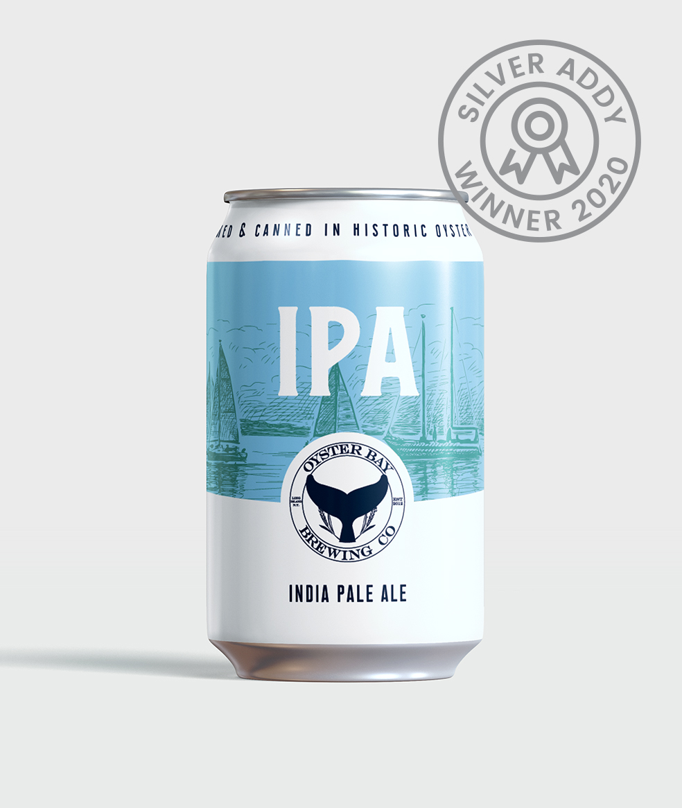
Oyster Bay Brewing Co has been serving high-quality beer in Long Island and beyond since 2012 and needed an updated brand to match. When we jumped on in 2015, we were determined to refresh their label artwork in a way that embodied the historic Oyster Bay area of New York yet could stand the test of time and a product line expansion.
Deliverables
01.
PACKAGING REFRESH
From the first talks with OBBC, we knew we wanted to maintain aspects of the well-loved brand, like their easily recognizable porthole logo and whale tail mark, while modernizing the design for a cleaner look that would pop on the shelf. Our challenge was bringing together historic and modern elements—two completely different styles—with a nod to Oyster Bay, NY’s nautical past.
Major Goals:
- Strengthen shelf presence and uniformity across core beers and future releases.
- Increase logo real estate on the packaging
02.
SPECIALTY BEER DESIGN
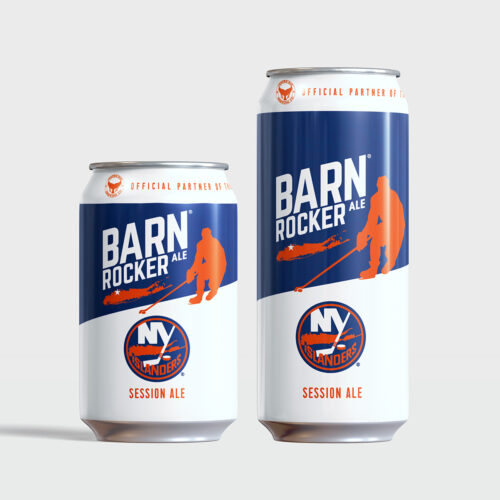
Oyster Bay first came to us for the design of their 12oz “Barn Rocker” cans: OBBC’s tribute to the NY Islanders’ last season at the Nassau Coliseum (lovingly known as the old barn). This special commemorative release pushed the small brewing team to nearly-national fame among fans of arena hockey, with Long Island-based professional sports complexes asking to stock the beer for fans season-round.
Utilizing the Islanders’ team colors, we were able to create an identity that paired well with the brewery’s existing brand standards. Paring back the existing design to a simpler, more minimalistic style for Barn Rocker opened the door for a redesign of OBBC’s core beer labels that felt timeless and recognizable.
03.
CORE BEERS REDESIGN
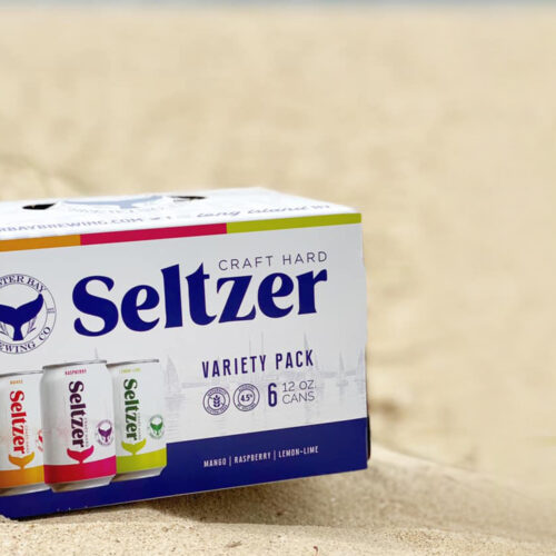
Our goal was to establish a core beer design that allowed for the easy addition of styles and sub-brands. No matter the season, variety, or release size, the redesign was intended to allow any can to easily be recognized as part of a larger whole.
A second consideration was how to pay homage to the history of Oyster Bay, NY without being left in the dust by the rest of the beer market. Styles, aesthetics, and preferences are shifting rapidly, on a national and local scale. We replaced the porthole logo and use of nautical-style accents with a standard “bay” backdrop as a clear yet subtle toast to the area’s geography.
By simplifying the label design and giving the OBBC logo a standard location and style, we were able to improve overall design flexibility moving forward.
04.
ECOMMERCE
Quick, bold, easy to navigate: these are our tenants when it comes to any eCommerce project. For OBBC, we developed an integrated eCommerce plan for website and email marketing including all the expected players: email flows, upsells, social media integrations, and a great navigation plan.
Major Goals:
Maintain back end management of orders (no new learning curve)
Increase design and content options
Cohesive approach for a multi-audience market
Read More: 5 Automated Emails To Boost Your E-Commerce Store
05.
WEBSITE REDESIGN + SEO
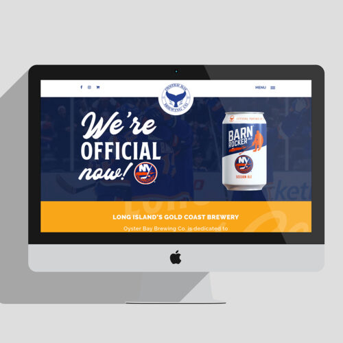
With Oyster Bay Brewing, we wanted to make sure the site reflected their brand style changes and was easy for users to find what they were looking for, quickly. With a handful of user journeys, logical organization and applicable content were essential in this site design.
Whether a customer was looking for gear to rep the brewery or a distributor needed a release schedule, we had to make sure each touchpoint was quick to load, easy to find, and fit seamlessly into the overall brand experience.
06.
EMAIL MARKETING
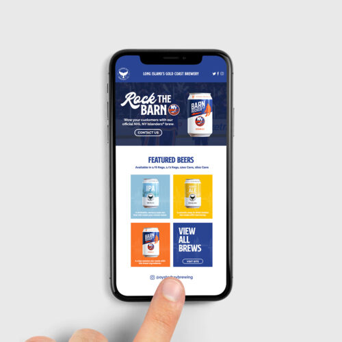
Using email campaigns to reach OBBC’s customers meant designing templates for multiple audiences (including wholesale and distribution, bars, locals, and online-only supporters) that all reflected the updated website and branding at large, with form integrations and a multi-channel marketing approach. It also allowed for more streamlined customer relationship management and marketing efforts.
Just as important as the website is a clear cohesive email template that provides information and an immediate solution or next step.


