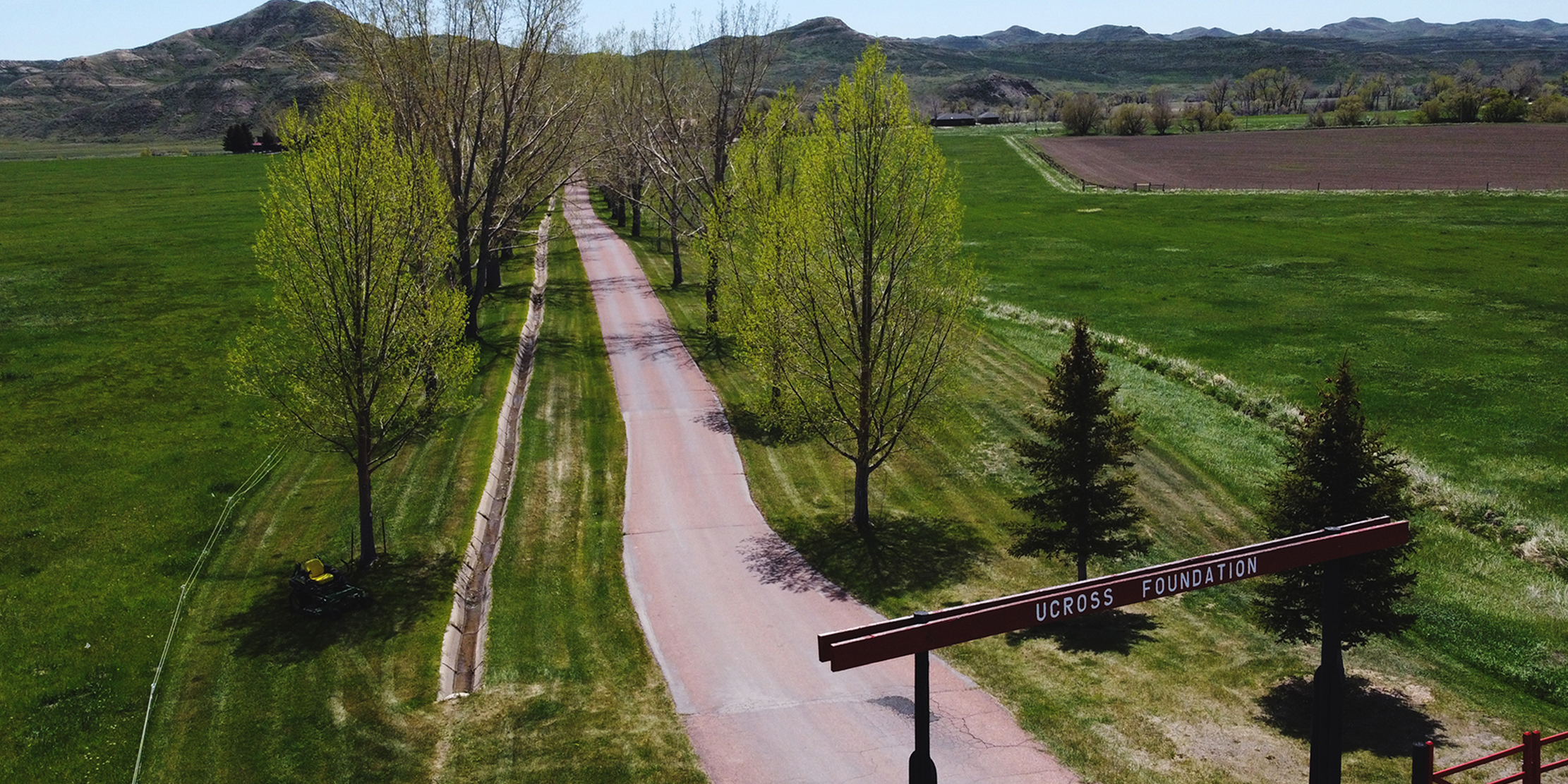
In the foothills of Wyoming’s Bighorn Mountains, the 20,000-acre UCROSS Foundation ranch is about as breathtaking as the art it inspires.
Since 1981, the foundation has made it their mission to “foster the creative spirit of deeply committed artists and groups” while acting as stewards of the historic ranch.
ABOUT
Writers, musicians, and artists of all disciplines have called the ranch’s studios and living spaces home for decades, but as times have changed, so too has UCROSS.
The BLKDOG team was tasked with bringing the facility, website, and print materials together to cohesively represent the organization’s next stage, improve promotion, and welcome the next generation of artists into the space.
DELIVERABLES
- Graphic Design
- Catalog Design
- Book Design
- Website Design + Development
- Signage System Design
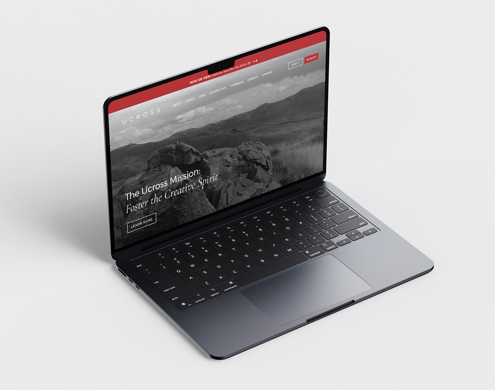
WEBSITE DESIGN + DEVELOPMENT
Our team took a two-prong approach to the website aspect of this project:
a short-term solution and a future-proof one.
Using design and user experience as our focal points, navigation is easier today as we prepare to launch a new website, one that lasts for years to come and fully represents the organization’s successes and benefits.
MAJOR GOALS:
-Improve user experience through eye breakup and visual guidance
-Clear, consistent reflection of the mission
-Prepare for and execute phase 2 migration of the website to WordPress platform
Weebly Site Refresh
Although limited by Weebly’s available functionality, the BLKDOG web and design teams got to work improving the UCROSS website’s navigation and functionality, aiming to improve the user experience, boost donations, and boost interest in residency programs.
Utilizing the UCROSS brand’s 2018 updates, we refreshed the existing website’s homepage to improve user experience in the short-term, ahead of a new website in development later this year. We also tweaked the main navigation for improved flow, added CTAs to reflect the organizations goals, and increased visual elements.
Re-Design + Development
For this phase, our team will focus on understanding and prioritizing the true purpose of the UCROSS website. Along with a more intentional design, our work includes restructuring the sitemap for better user flow and improved search engine ranking.There are a number of user journeys possible for visitors. As such, logical organization and on-brand content will be essential, as will ensuring that each touchpoint is quick to load, easy to find, and feels like one part of a whole.The new website will also have a stronger foundation to support ongoing growth. By pivoting to WordPress, the organization will have greater flexibility and improved scalability for years to come.
he ranch provides private studios and living accommodations to resident artists, allowing them to focus on their work in the tranquil Wyoming countryside.
The ranch covers a vast expanse of land, making it an important area for conservation efforts in Wyoming.
The Ucross Foundation, which oversees the Ucross Ranch artist residency program, also hosts cultural events and activities.
ON-PREMISE DESIGN
As the foundation celebrates 40 years in operation and nearly as many offering artist residencies, it is also in the process of completing a transformation of the existing studios, galleries, and living spaces.
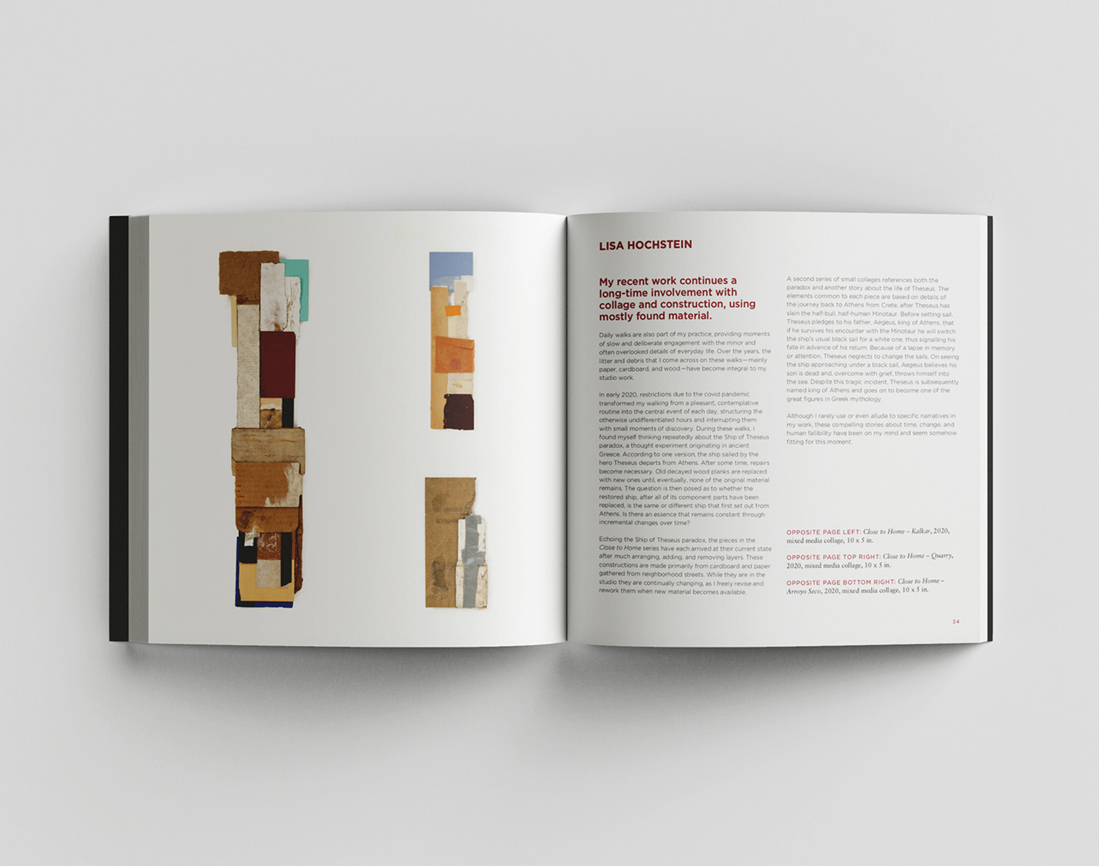
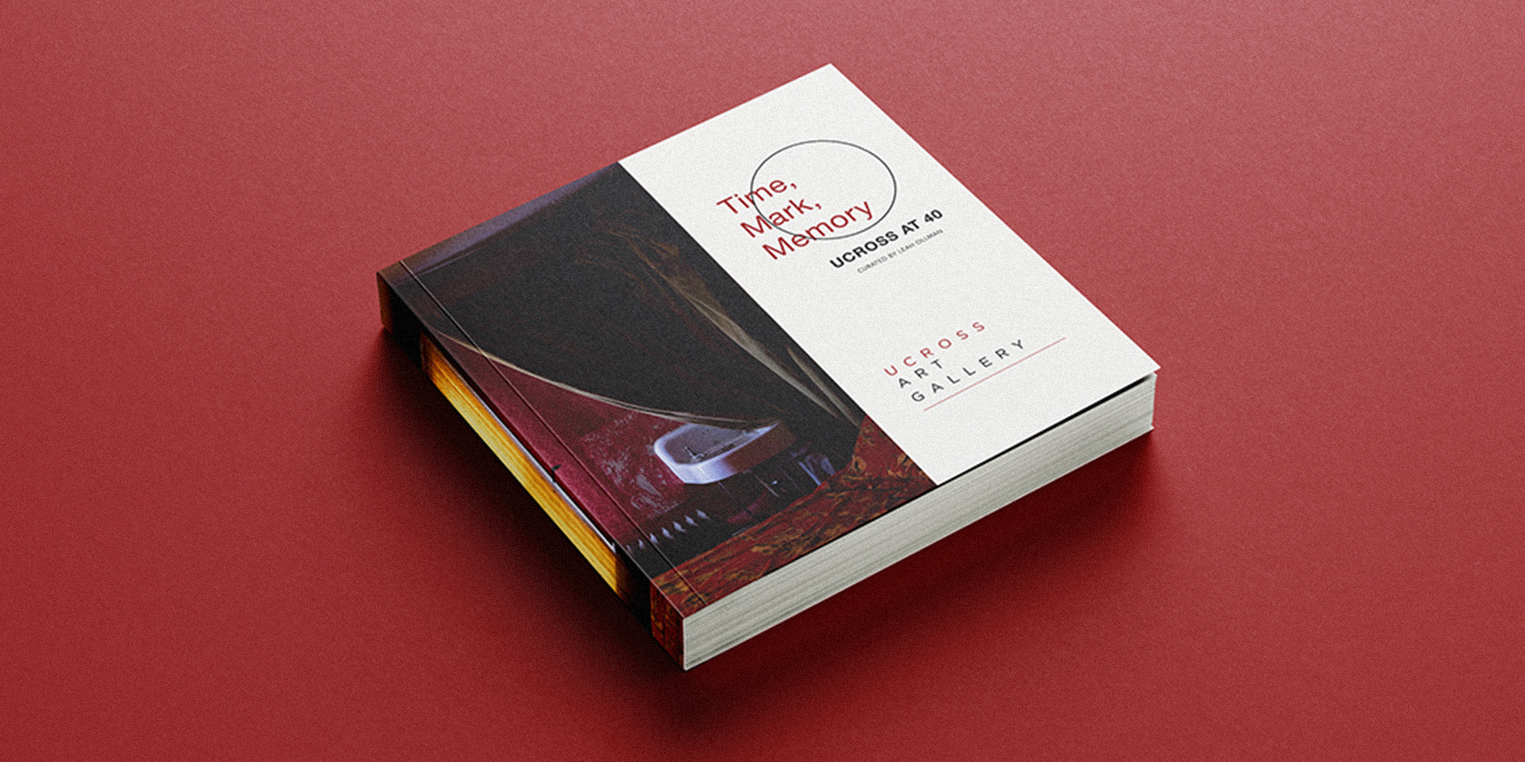
To celebrate this milestone, UCROSS sought to update their on-site signage to better reflect their current brand, accent the landscape, and improve navigation. Additionally, the foundation seeks to print a “Box Set” catalog to celebrate the anniversary and upcoming alumni exhibits.
MAJOR GOALS:
-Create a system of hierarchy for all spaces, current and future
-Maintain historic fabric of site buildings when removed
-Establish a catalog design to work independently and across the three pieces of the series
Sight Signage
The name of the game for a successful launch of the facility’s updates was function. The ranch is vast and beautiful, and we knew the signs, like the buildings they’d identify, should stand out without taking away from that landscape. To ensure we got it right, Jesse headed out to UCROSS to absorb the atmosphere, understand a visitor’s needs, and get a tour of the space.
We created a cohesive and modern design to ensure all room placards, wayfinding signs, directional signs, and off-site signs were easily spotted without being obtrusive. A hierarchy plan ensures this design can be used for future expansions or changes.
Print + Digital Collateral
Bouncing off the signage updates, we designed a coordinating layout for digital signage, and a series of catalogs in celebration of the foundation’s 40th anniversary. The box set of catalogs will feature the three upcoming exhibitions of UCROSS alumni, and work includes graphic design, file setup, typesetting and layout, plus prep of images and files for professional production.
